British Rail Logo
Design Research Unit
Gerry Barney
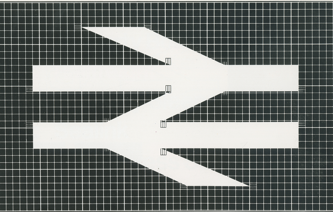
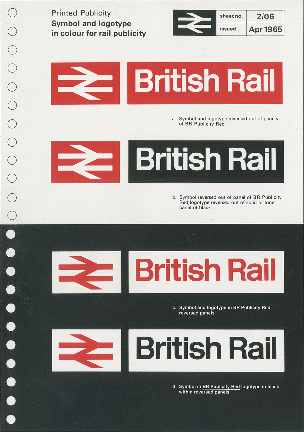
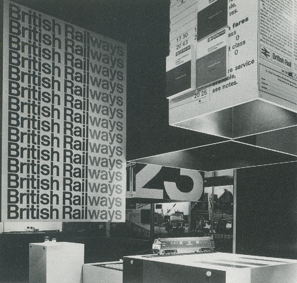
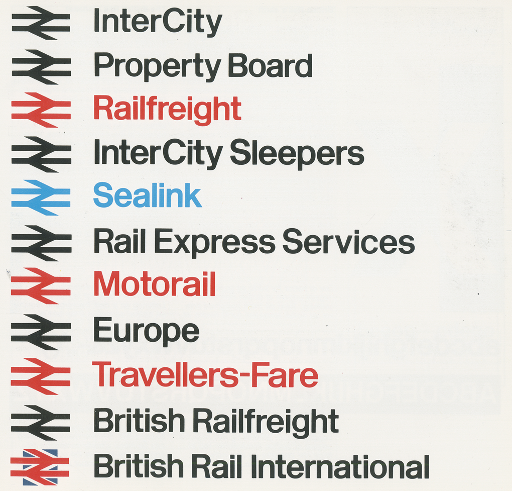
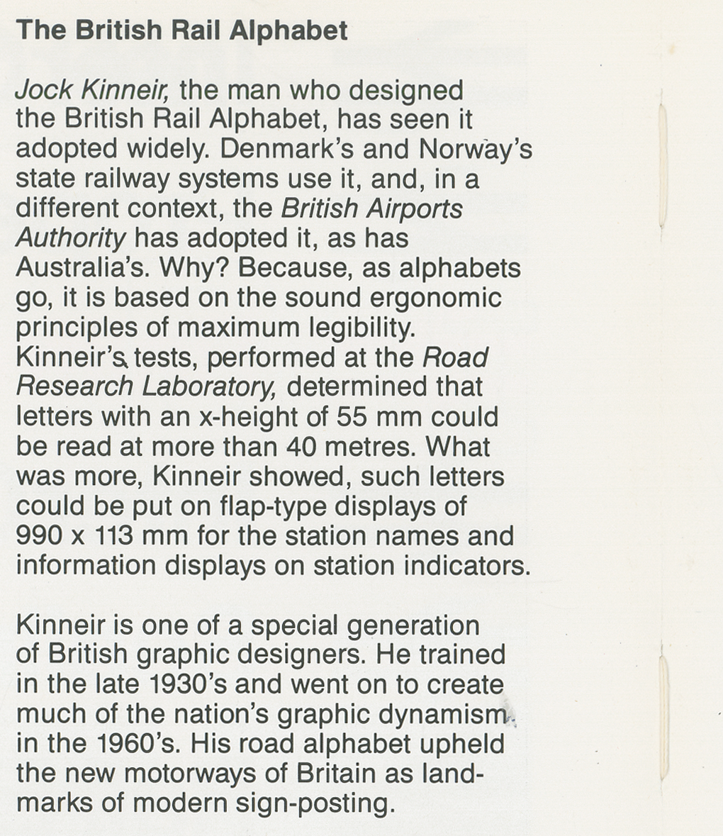
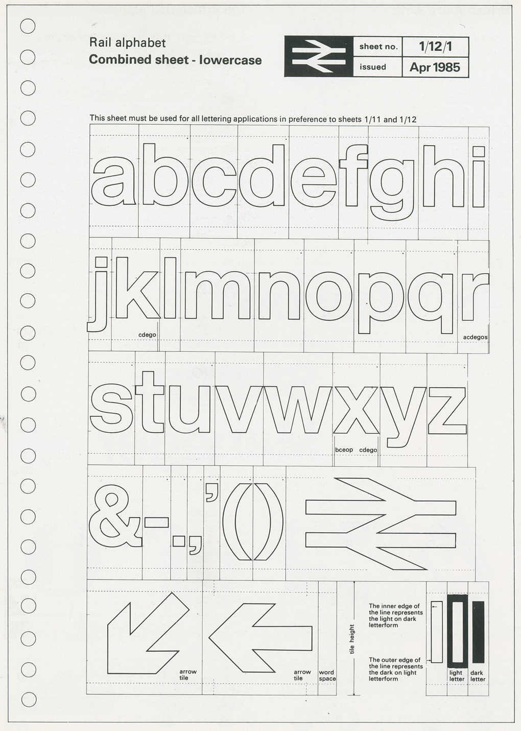
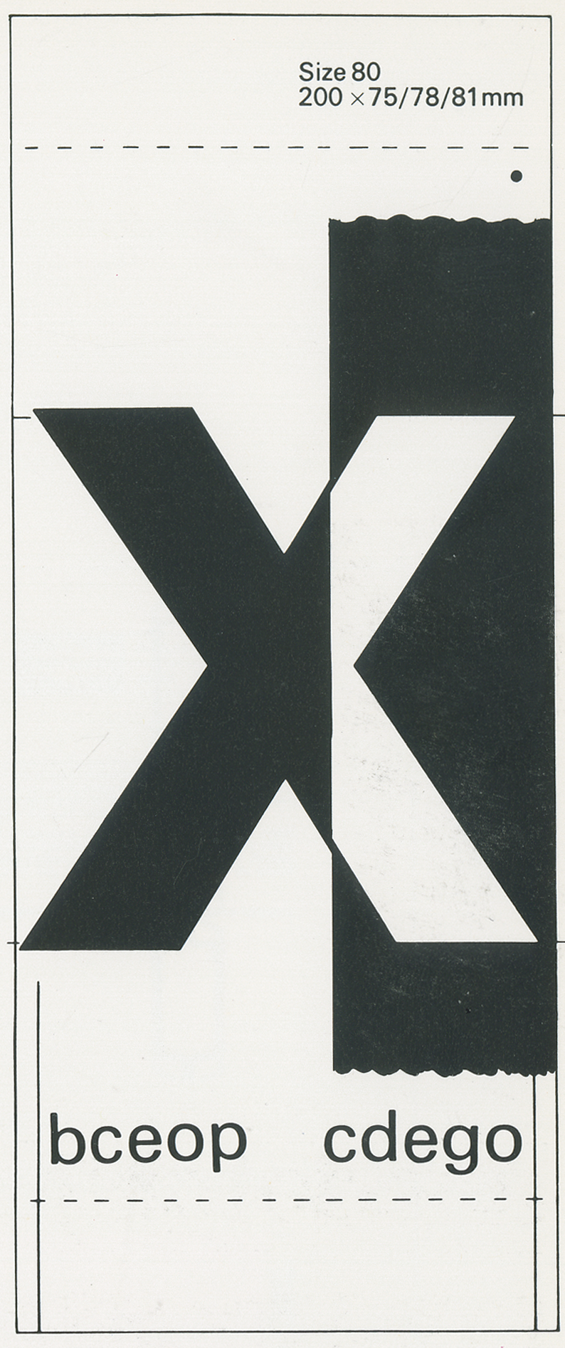
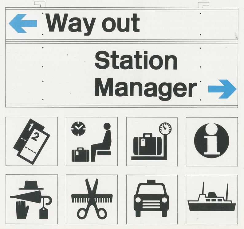
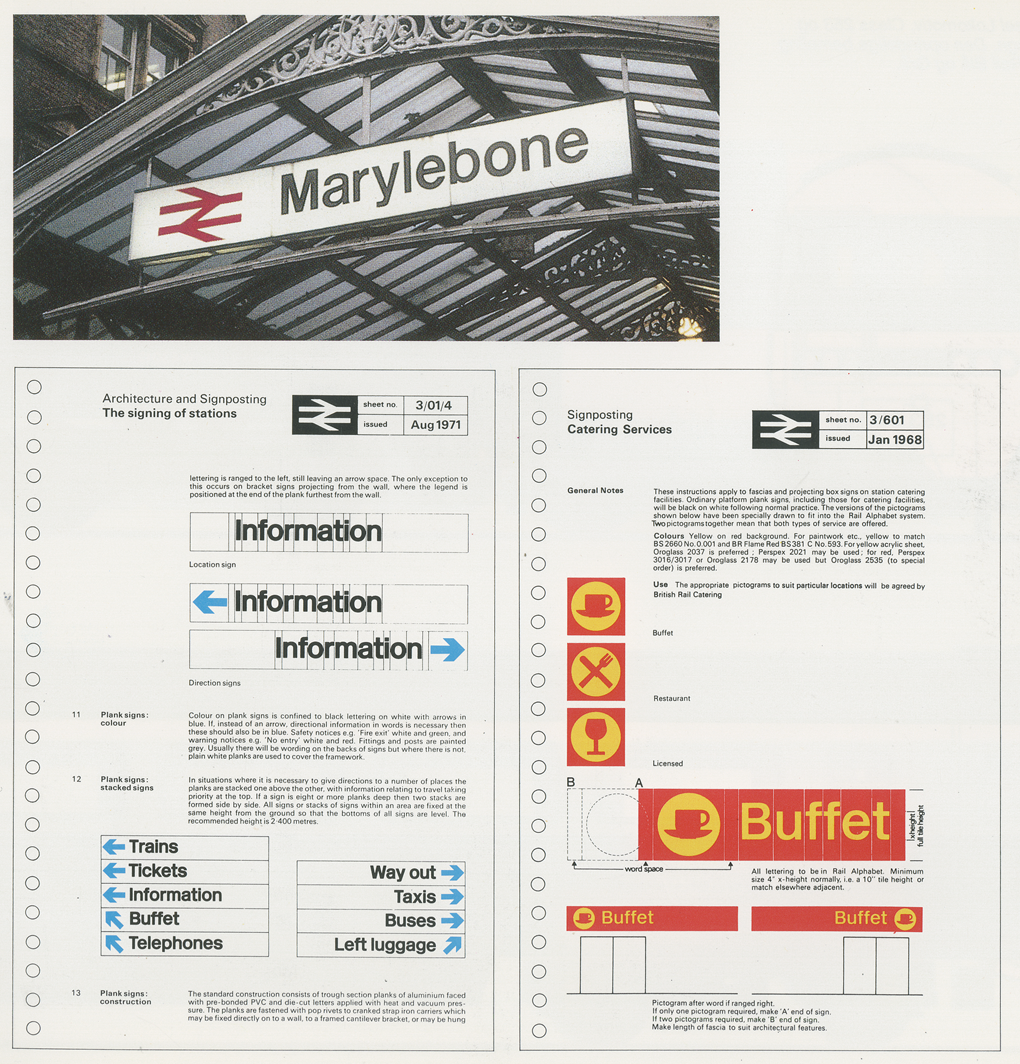
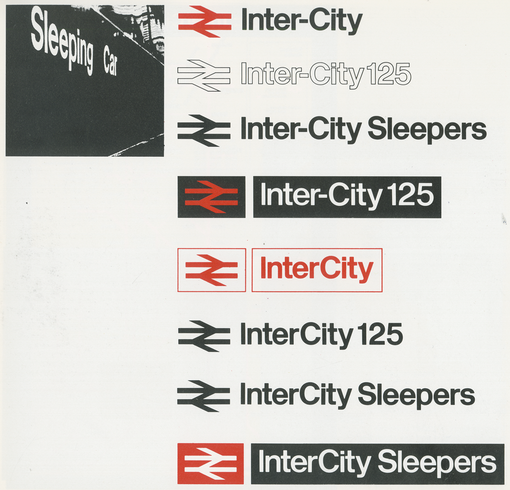
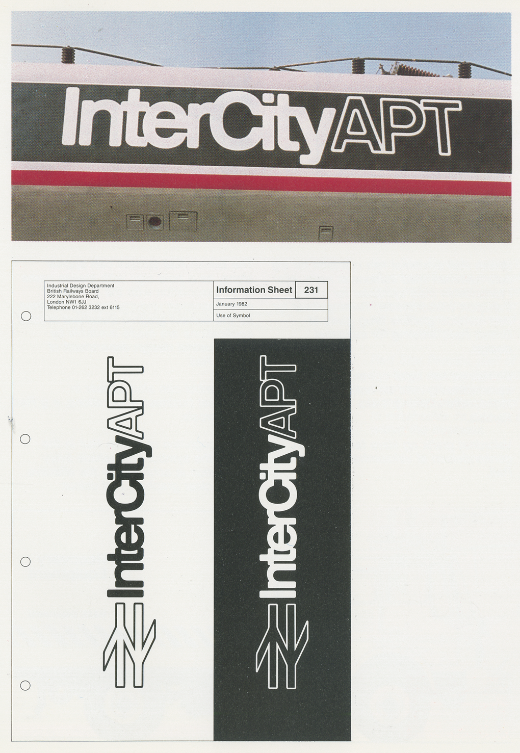
I'm no expert on design but I know that the double arrow logo of British Rail is a beautiful piece of mark making. It gets better the more you look at it, has been taken up by countries around the world as the standard sign for railway station and was, apparently, originally drawn on the back of an envelope. The story goes that the studio behind it, Design Research Unit, drew around 50 symbols and then alongside a British Rail representative narrowed these down to a shortlist of six. It then came down to two designs and this logo strangely didn't win the competition but the winning logo was leaked to the press which was a pretty big deal at the time, leaving this one, designed by 21 year old Gerry Barney as the winner. The alphabet was designed by Jock Kinneir, and has been, as you can read below, widely adopted.
All of these images are taken from a book called British Rail Design written by James Cousins and published by the Danish Design Council in 1986. Excuse my scanning.

