Paula Scher
Manhattan Records Identity
I've always loved the design of this label and was given a book on Paula Scher of Pentagram where she discusses the design. In 1984 Manhattan Records (part of EMI) were setting up their new new offices and needed a new identity. They wanted something obvious - like a skyscraper or the NY skyline - but designer Paul Scher had another idea.
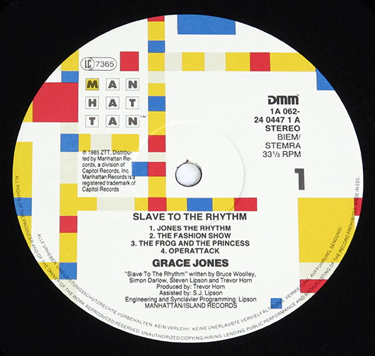
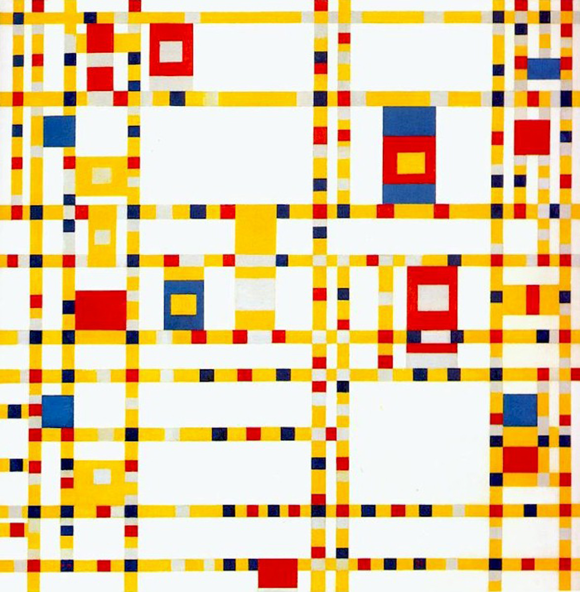
"I was always much more comfortable with selecting a typeface that had a strong character, that somehow related to the situation at hand, and then modifying it to create a specific thought of spirit (...) I became interested in what communication material looked like in its totality, not the small corner that housed the logotype. I leafed through 'The Art Of New York' to figure out how a painting of a building could be manipulated to conform to all the various needs demanded by an identity for a record label, without becoming another trademark jammed into a corner. Then I came across the Mondrian painting Broadway Boogie-Woogie (below), which is an abstracted map of Manhattan.
The logic for using this painting as an identity for Manhattan Records was obvious: it ostensibly represented Manhattan and was inspired by music. But its strongest attribute was that the painting's colour blocks could easily be reconfigured for a multitude of uses. I began considering the logotype as something that came out of the red, blue, and yellow boxes of the painting. A logo in a grid, like the city. The character count of the word Manhattan was perfect, allowing for three stacks of three-letter units: MAN, HAT, TAN. It was my first and only idea for the logo."
Excerpt from 'Make It Bigger' Paula Scher, 2002 and in turn quoted in 'Hall Of Femmes: Paula Scher'. Thank you to Matilda Flodmark.